A
Product as hero
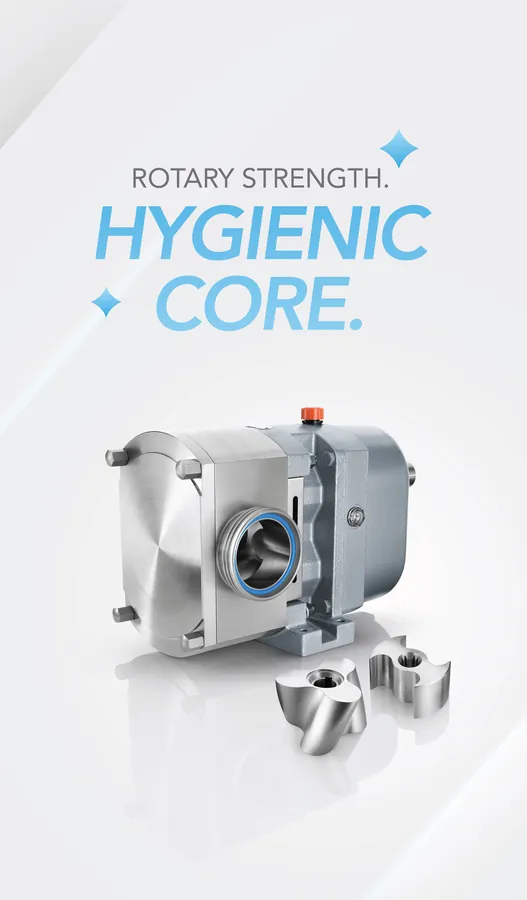
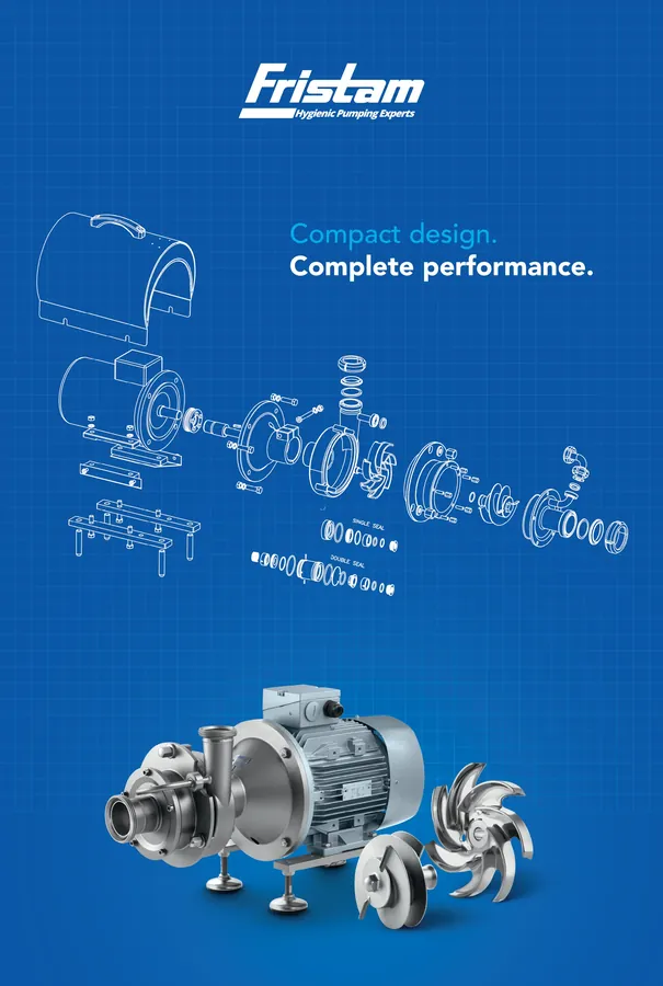
Studio-lit product renders, explosion views and blueprint grids that let the precision of each pump speak.

Case Study · Fristam Pumps India
How we gave Fristam, the hygienic pumping experts, one confident voice across brand films, LinkedIn, product visuals, large-format print and an international exhibition.
01
Project Overview
Fristam builds hygienic pumps: stainless-steel equipment that sits inside dairy, food and process plants. It is precise, critical hardware that most people never see. Our job was to make that engineering visible, and to make it feel as refined as the product itself.
The engagement brought together cinematic brand films, motion graphics, LinkedIn thought-leadership, product explosion-view visuals, large-format print standees and a dedicated campaign for Gulfood Manufacturing 2026 in Dubai.
02
About Fristam
Fristam Pumps India designs and supplies hygienic pumping solutions for process industries, with dairy at the heart of its story.
03
Project Background
Fristam talks to plant heads, process engineers and procurement teams: people who buy on specification and trust. The brand needed to show up for them consistently, all year round.
That meant one identity flexible enough for a product launch, a technical article, a festive greeting, a LinkedIn cover and a 2.34-metre exhibition standee, and strong enough to be recognised in any of them within a second.

04
Challenges
Pumps are functional, metallic objects. They had to look as precise and desirable as the engineering inside them, and connect to the everyday products they help create.
Cavitation, materials of construction, viscosity, shear sensitivity and aeration are complex subjects. They needed to stop the scroll without losing technical credibility.
From 1080 px social posts and ultra-wide LinkedIn covers to vertical films and print panels up to 1370 × 2340 mm, every piece had to belong to the same family.
Diwali, Independence Day, World Environment Day and a major trade show each called for warmth and relevance, while still sounding like an engineering brand.
05
Our Approach
We built every piece of communication around four ideas, so each post, film and banner reinforced the next.
Studio-lit product renders, explosion views and blueprint grids that let the precision of each pump speak.
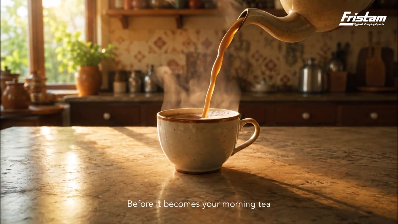
Cinematic films that follow milk on its journey through stainless-steel processing before it becomes part of every home.
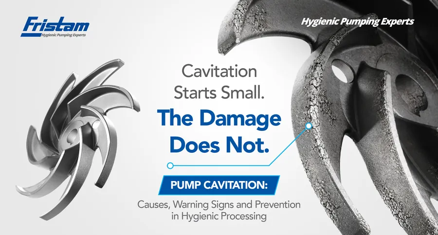
LinkedIn articles and carousels on pump selection, cavitation, whey transfer and specialty alloys that position Fristam as the expert voice.
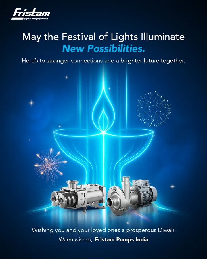
Festive, national and environmental moments told through the same blue light and engineering craft.
06
Strategy & Execution
Six films carry the brand through process, product and occasion. The hero film follows milk on its journey through hygienic processing, before it becomes part of every home.
Article banners and carousels turn engineering knowledge into a reason to follow. Each one leads with a sharp line and a single, unmistakable visual.
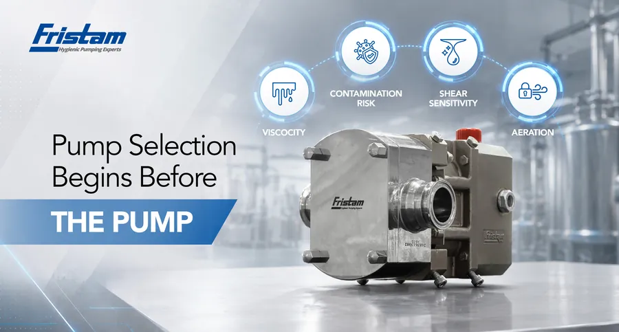
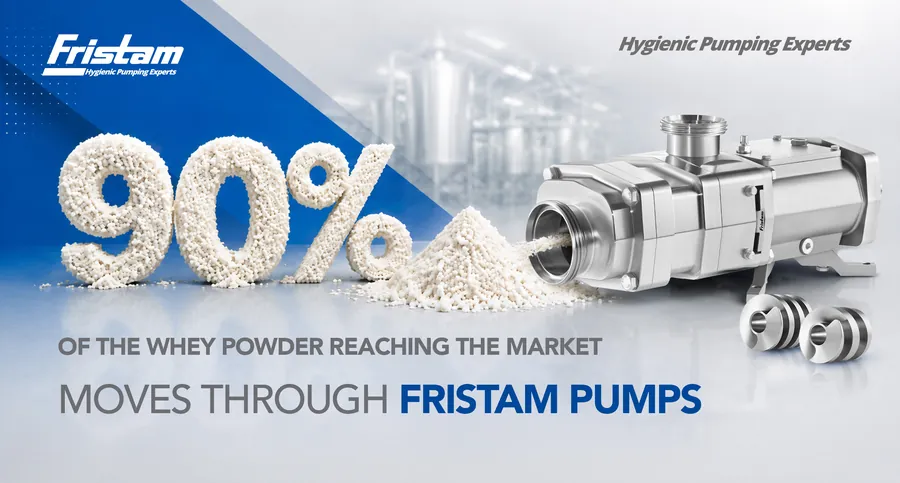
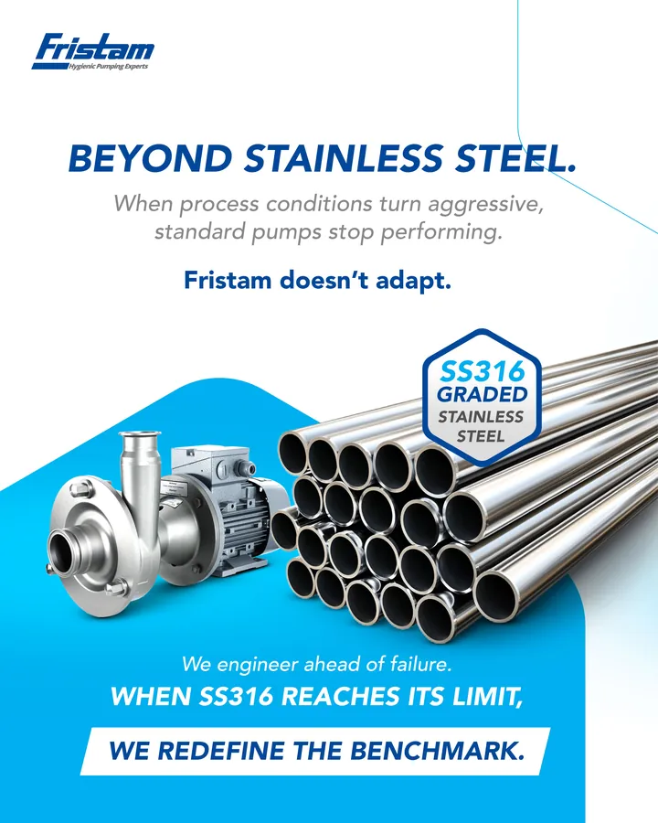
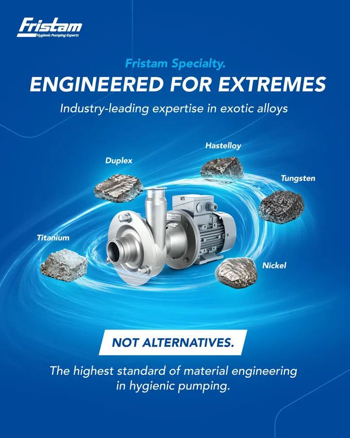
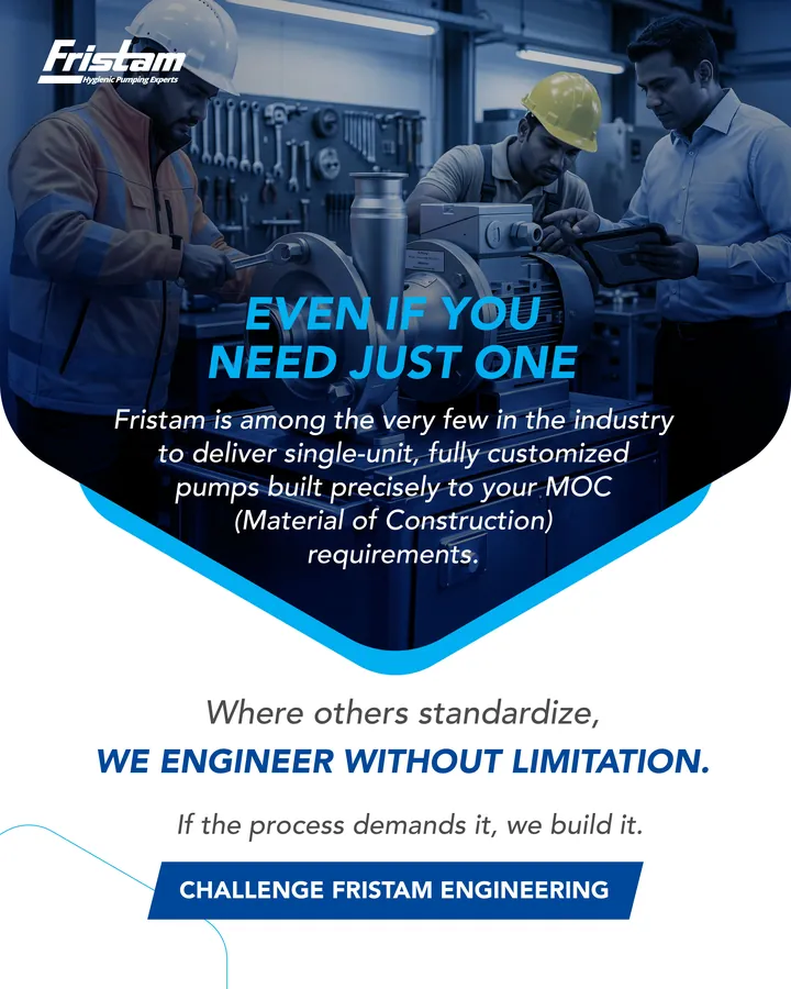
Carousel · Specialty Materials of Construction
A three-slide story: when SS316 reaches its limit, Fristam redefines the benchmark with exotic alloys, and builds even a single, fully customised pump to the required MOC.
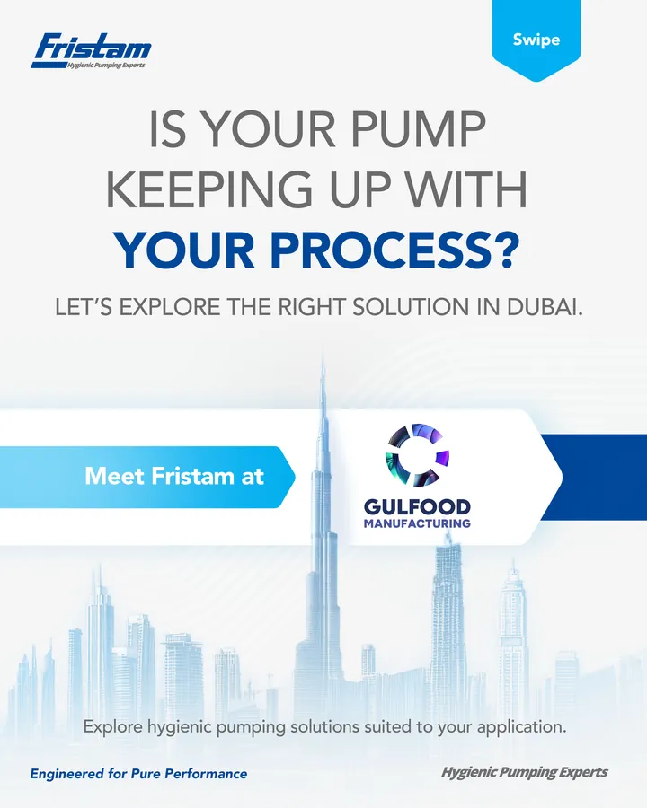
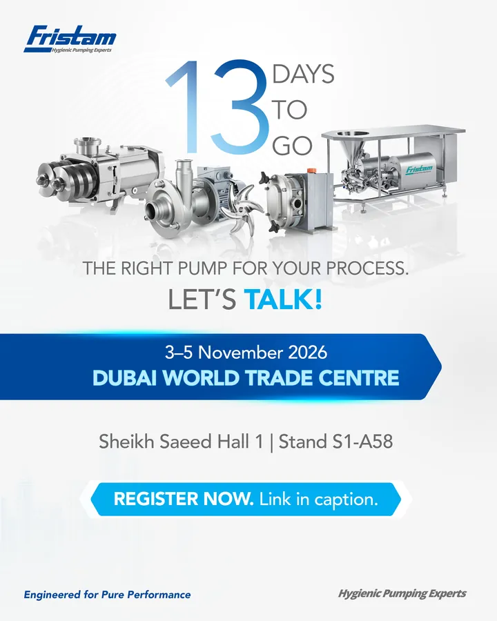
A countdown campaign invited visitors to meet Fristam at the Dubai World Trade Centre, framed around one question: is your pump keeping up with your process?
Large-format print
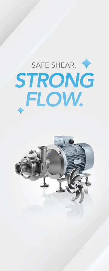
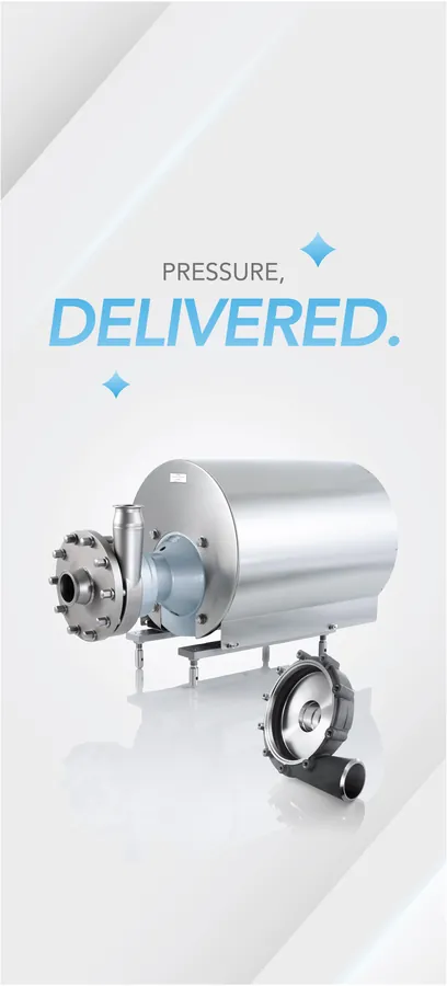
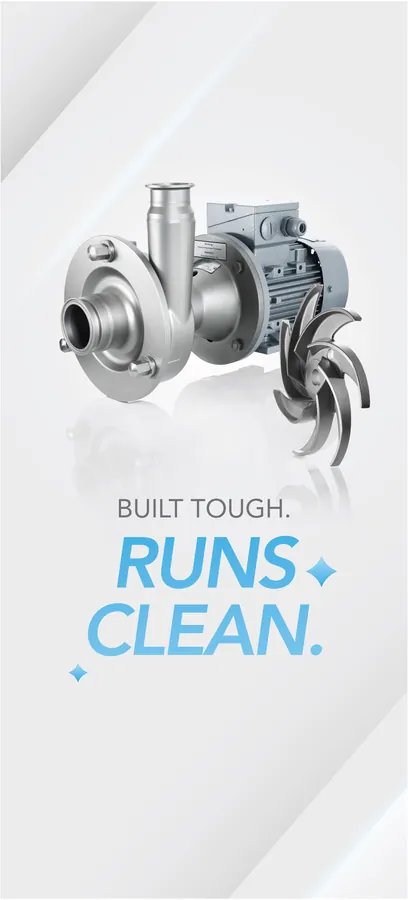
Each panel pairs one pump with one benefit, written in a short two-beat headline and lit with the same cool, clean studio light.
07
Design & Development
We distilled Fristam’s identity into a small set of rules that any designer, animator or printer could follow.
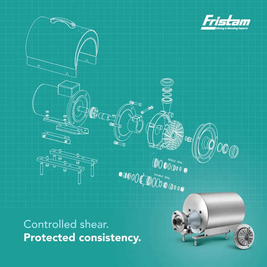
Line-art exploded drawings over a blueprint grid reveal every component, then resolve into the finished render. Engineering becomes the visual.
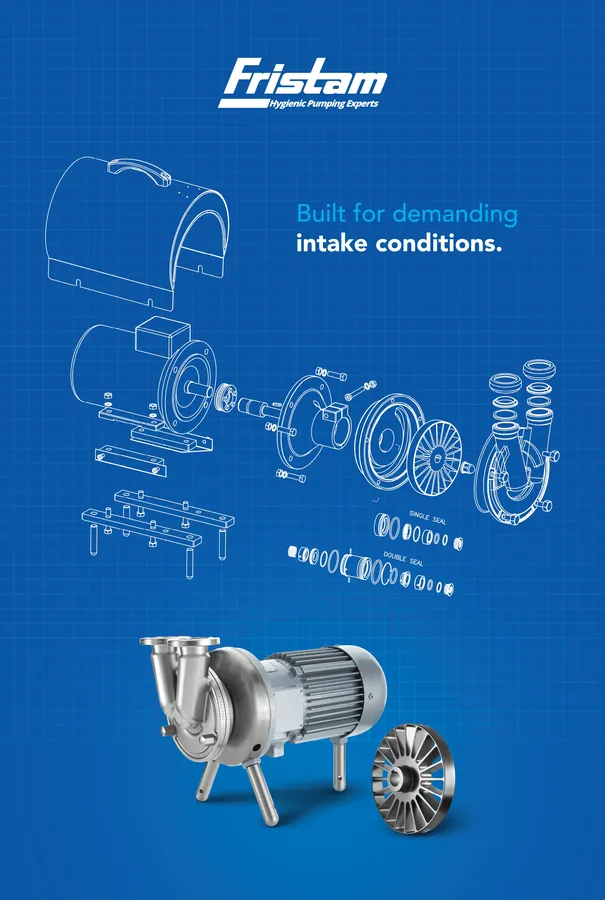
The same layout flexes in colour to separate product families, like this teal mixing and blending visual, while staying unmistakably Fristam.
“Safe shear. Strong flow.” “Built tough. Runs clean.” Short, rhythmic lines with the benefit set in bold italic cyan, echoing the slant of the Fristam wordmark.
Every static closes on the same base line: “Engineered for Pure Performance” on the left, “Hygienic Pumping Experts” on the right. It is a small detail that builds recognition over time.
08
Final Outcome
The result is a recognisable, premium visual and verbal system for Fristam that works from a phone screen to an exhibition hall. The body of work delivered:
“Your production doesn’t pause. Neither does our commitment.”
Fristam festive-season campaign line
09
Project Gallery
LinkedIn cover banners